Carousel List
The Carousel List component enables duplication of cards or rows with consistent structure in a carousel, allowing for containment of other components. By default, editing or moving a component will apply changes to all cards or rows, while still allowing customization and exceptions for unique values per component.
To add a component to a card, you can either click on Insert while you select the container, or you can move an existing component by copy/pasting it.
Editing or moving a component will apply changes to all cards or rows.
To customize the settings of components within each time, you can use iter.index and iter.value.
-
iter.indexwill retrieve the index number of each card (0, 1, 2 etc.). -
iter.value.keywill retrieve the value of each key defined in theitemssection.
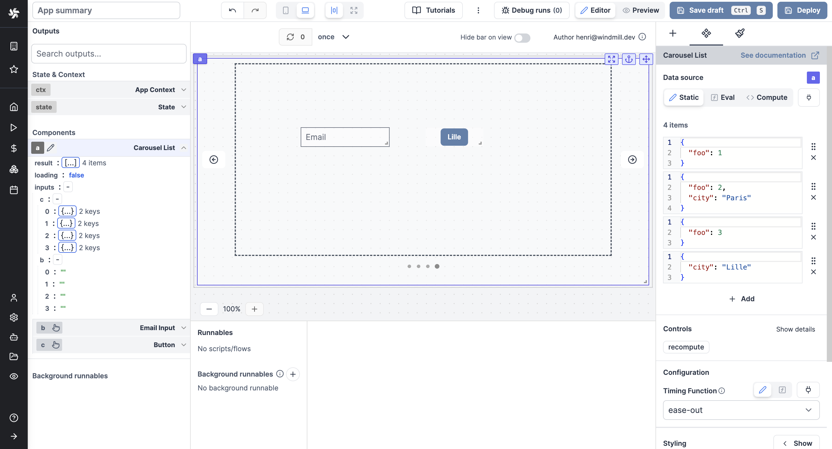
List components also support having inputs set inside them. Retrieve the values of each in the inputs field of the List component in the outputs menu.
The following section details Carousel List component's specific settings. For more details on the App Editor, check the dedicated documentation or the App Editor Quickstart:
Carousel List configuration
| Name | Type | Connectable | Templatable | Default | Description |
|---|---|---|---|---|---|
| Items | array | true | false | 3 items | The Carousel List items in JSON. |
| Timing Fonctions | select ("linear", "ease", "ease-in", "ease-out", "ease-in-out") | true | false | "linear" | Sets how an animation progresses through the duration of each cycle, see https://developer.mozilla.org/en-US/docs/Web/CSS/animation-timing-function |
Outputs
| Name | Type | Description |
|---|---|---|
| result | any | The result of the list component. |
| loading | boolean | The loading state of the component. |
| inputs | any | The inputs of the component. |